CSS 实现水平垂直居中的方式
Category(分类): CSS Status: 已整理
“如何让一个元素水平垂直居中?”看似简单,但实现方式取决于很多条件:
- 子元素是块级元素、行内元素还是行内块元素?
- 子元素尺寸是否确定?
- 父元素是否有明确的宽高?
- 是否需要兼容旧浏览器?
- 需要水平居中、垂直居中,还是两个方向同时居中?
现代项目优先考虑 Flexbox 和 Grid。绝对定位、表格布局、line-height 和百分比 padding 仍然有特定适用场景,也值得了解。
一、水平居中
1. 块级元素使用 margin: 0 auto
margin: 0 auto 应该设置在需要居中的子元素上,而不是父元素上:
<div class="parent">
  <div class="child">块级元素</div>
</div>
.parent {
  width: 100%;
}

.child {
  width: 200px;
  margin: 0 auto;
}
使用条件:
- 子元素应处于普通块布局中;
- 子元素需要有明确宽度,或宽度受到
max-width等约束; - 子元素不能宽于父元素,否则可能出现溢出。
如果子元素的 width 是 auto,块级元素通常会占满可用宽度,此时不会表现为一个有可见左右空白的“居中盒子”。
2. 行内元素和行内块元素使用 text-align: center
.parent {
  text-align: center;
}

.child {
  display: inline-block;
}
text-align 作用于父元素的行内内容,因此可以让文本、图片和行内块元素水平居中,但不能直接让普通块级子元素水平居中。
二、单行文本的垂直居中
使用相同的 height 和 line-height
.text {
  width: 200px;
  height: 200px;
  color: #333;
  text-align: center;
  line-height: 200px;
  background: skyblue;
}
<div class="text">单行文本垂直居中</div>
这种方法适合单行文本。对于多行文本,固定 line-height 会造成布局异常,应使用 Flex、Grid、表格单元格或其他适合多行内容的方案。
三、使用绝对定位居中
绝对定位方案需要先确认定位包含块。通常给父元素设置:
.parent {
  position: relative;
}
1. 已知尺寸:负外边距
如果子元素宽高已知,可以将子元素左上角移动到父元素中心,再通过负外边距移动回自身尺寸的一半:
<div id="box">
  <div id="child">已知尺寸</div>
</div>
#box {
  position: relative;
  width: 300px;
  height: 300px;
  background: #ddd;
}

#child {
  position: absolute;
  top: 50%;
  left: 50%;
  width: 150px;
  height: 100px;
  margin-top: -50px;
  margin-left: -75px;
  background: orange;
}
如果希望写成一个四值简写:
margin: -50px 0 0 -75px;
这种方案依赖子元素的准确宽高,尺寸变化后需要同步修改负外边距。
2. 已知尺寸:使用 calc()
也可以直接计算左上角偏移量:
#child {
  position: absolute;
  top: calc(50% - 50px);
  left: calc(50% - 75px);
  width: 150px;
  height: 100px;
  background: orange;
}
这里的 50px 和 75px 分别是子元素高度和宽度的一半。父元素必须是绝对定位元素的包含块,并且具有明确的可用尺寸。
3. 未知尺寸:使用 transform
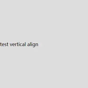
如果不知道子元素的宽高,可以使用 transform 的百分比平移。translate() 的百分比相对于元素自身尺寸计算:
#child {
  position: absolute;
  top: 50%;
  left: 50%;
  transform: translate(-50%, -50%);
  background: orange;
}
这是一种简洁、常用的未知尺寸居中方案。需要注意,transform 通常只改变视觉位置,不会让普通流中的其他元素重新布局,并且可能创建层叠上下文。
4. 绝对定位配合 margin: auto
已知子元素宽高时,可以让四个方向都贴到父元素边界,再使用自动外边距:
#box {
  position: relative;
  width: 300px;
  height: 300px;
  background: #ddd;
}

#child {
  position: absolute;
  inset: 0;
  width: 200px;
  height: 100px;
  margin: auto;
  background: orange;
}
也可以只实现垂直居中:
#child {
  position: absolute;
  top: 0;
  bottom: 0;
  width: 200px;
  height: 100px;
  margin-block: auto;
}
top 和 bottom 通常使用 0。不建议使用 99999px 或 -99999px 等极大值,过度约束可能导致溢出或无法得到预期结果。
如果子元素宽高都是 auto,这种方案的结果会受到内容尺寸和替换元素固有尺寸影响,因此不能把它作为所有未知尺寸元素的通用方案。
四、使用 Flexbox
Flexbox 是现代项目实现水平垂直居中的常用方案:
<div class="container">
  <div class="item">水平垂直居中</div>
</div>
.container {
  display: flex;
  align-items: center;
  justify-content: center;
  width: 300px;
  height: 300px;
  background: #ddd;
}

.item {
  background: greenyellow;
}
justify-content控制主轴方向的对齐;align-items控制交叉轴方向的对齐;- 默认
flex-direction: row时,主轴是水平方向,交叉轴是垂直方向; - 父元素必须有可用的高度,垂直居中才有可观察的空间。
如果改变主轴方向:
.container {
  display: flex;
  flex-direction: column;
  align-items: center;
  justify-content: center;
  width: 300px;
  height: 300px;
}
此时主轴变为垂直方向,justify-content: center 负责垂直居中,align-items: center 负责水平居中。
使用 margin: auto 的 Flex 写法
Flex 项目也可以通过自动外边距实现双向居中:
.container {
  display: flex;
  width: 100vw;
  height: 100vh;
}

.container > div {
  margin: auto;
}
自动外边距会吸收可用空间,使子元素位于容器中央。原始示例中的 width: 100vw 后缺少分号,已修正。
五、使用 CSS Grid
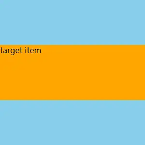
对于单个元素的水平垂直居中,Grid 可以直接使用:
<div id="box">
  <div class="target">target item</div>
</div>
#box {
  display: grid;
  place-items: center;
  width: 300px;
  height: 300px;
  background: #ddd;
}

.target {
  background: orange;
}
place-items: center 是以下两个属性的简写:
align-items: center;
justify-items: center;
也可以只对目标元素设置:
#box {
  display: grid;
  width: 300px;
  height: 300px;
}

.target {
  place-self: center;
}
现代主流浏览器已经广泛支持 Grid。只有在需要兼容非常旧的浏览器时,才需要额外考虑 fallback。
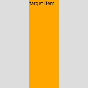
使用辅助列实现水平居中
如果要保留原文中通过左右辅助元素实现布局的思路,可以使用:
<div id="box">
  <div></div>
  <div class="target">target item</div>
  <div></div>
</div>
#box {
  display: grid;
  grid-template-columns: 1fr auto 1fr;
  align-items: center;
  width: 300px;
  height: 300px;
  background: #ddd;
}

.target {
  justify-self: center;
  background: orange;
}
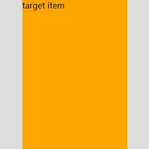
如果目标元素宽度已知,也可以使用原文中的固定中间列:
#box {
  display: grid;
  grid-template-columns: 1fr 211px 1fr;
  width: 300px;
  height: 300px;
}

.target {
  width: 211px;
  justify-self: center;
  background: orange;
}
在没有内边距、边框和间隙的情况下,两侧列的剩余宽度分别约为:
(300px - 211px) / 2 = 44.5px
不过,对于单个元素居中,直接使用 place-items: center 通常更简单,也不需要额外的辅助元素。
六、使用 display: table-cell
这是传统项目中常见的兼容方案。父元素设置为表格容器,子元素设置为表格单元格:
<div class="table-box">
  <div class="table-cell">
    <div class="table-content">table-cell 居中</div>
  </div>
</div>
.table-box {
  display: table;
  width: 500px;
  height: 500px;
  background: pink;
}

.table-cell {
  display: table-cell;
  text-align: center;
  vertical-align: middle;
}

.table-content {
  display: inline-block;
  width: 200px;
  height: 200px;
  background: skyblue;
}
vertical-align 对 table-cell 生效,text-align: center 负责单元格内的水平居中。
vertical-align 的适用范围
原文称 vertical-align 只有设置了 HTML valign 属性才有效,这是错误的。CSS vertical-align 可以用于:
- 行内元素;
- 行内块元素;
- 表格单元格;
- 参与行内格式化或表格布局的盒子。
valign 是传统 HTML 属性,不是 CSS vertical-align 生效的前提。常见取值包括:
top:顶部对齐;middle:中线对齐;bottom:底部对齐;baseline:基线对齐。
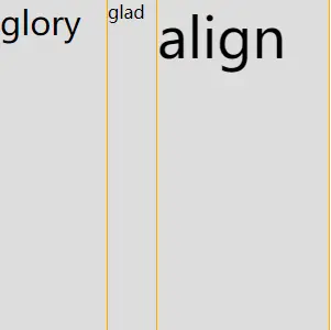
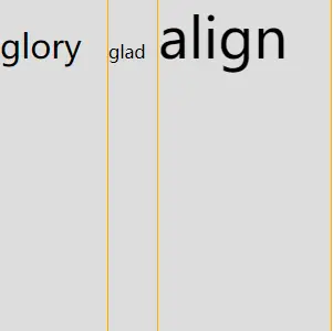
在表格单元格中,baseline 会让单元格内容按照基线规则参与对齐。基线是文本排版中的一条参考线,不等同于元素的几何中心。
<div class="baseline-table">
  <div class="baseline-cell first">glory</div>
  <div class="baseline-cell second">glad</div>
  <div class="baseline-cell third">align</div>
</div>
.baseline-table {
  display: table;
  width: 300px;
  height: 300px;
  background: #ddd;
}

.baseline-cell {
  display: table-cell;
  vertical-align: baseline;
  border-right: 1px solid orange;
}

.first {
  font-size: 30px;
}

.third {
  font-size: 50px;
}
七、使用 line-height 和 vertical-align 对图片居中
传统写法如下:
.image-box {
  width: 300px;
  height: 300px;
  line-height: 300px;
  text-align: center;
  font-size: 0;
  background: #ddd;
}

.image-box img {
  width: 200px;
  height: 200px;
  vertical-align: middle;
}
这种方法依赖行盒和基线规则,适合维护旧代码。现代项目通常更推荐:
.image-box {
  display: flex;
  align-items: center;
  justify-content: center;
}
八、使用 padding 实现内容周围等距
如果父元素高度由内容自动撑开,可以使用相等的上下内边距:
<div class="padding-box">
  <div class="padding-content">内容</div>
</div>
.padding-box {
  width: 300px;
  padding-block: 100px;
  background: #ddd;
}

.padding-content {
  width: 200px;
  height: 100px;
  background: orange;
}
这种方式是让内容上下的内边距相等,并不是在固定高度的父容器中进行真正的几何居中。父元素通常不能再设置一个与 padding 和内容高度冲突的固定高度,否则会影响预期结果。
九、各种方案的选择
| 方案 | 尺寸要求 | 适用场景 | 主要注意点 |
|---|---|---|---|
margin: 0 auto | 块级子元素通常需要宽度 | 水平居中 | 只负责水平方向 |
text-align: center | 行内或行内块内容 | 文本、图片、按钮 | 不能直接居中普通块盒 |
line-height | 通常适合单行文本 | 旧代码中的单行文本 | 不适合多行文本 |
| 负外边距 | 需要知道尺寸 | 传统绝对定位 | 尺寸变化需同步修改 |
transform | 不要求知道尺寸 | 绝对定位居中 | 可能创建层叠上下文 |
position + margin: auto | 通常需要明确尺寸 | 绝对定位元素 | 需要正确设置 inset |
padding | 父元素高度自动 | 内容上下等距 | 不是固定高度容器居中 |
| Flexbox | 父元素有可用空间 | 通用水平垂直居中 | 现代项目优先 |
| Grid | 父元素有可用空间 | 单项或网格布局 | 可使用 place-items |
table-cell | 父元素有宽高 | 传统兼容场景 | 布局语义较旧 |
十、常见排查问题
1. 垂直居中没有效果
检查:
- 父元素是否有明确高度或可用高度;
- Flex 的
align-items和justify-content是否放在正确的轴上; - 绝对定位元素的父级是否设置了
position: relative; top: 50%的百分比是否相对于正确的包含块;height: 100%的父级高度是否确定。
2. transform: translate(-50%, -50%) 为什么可以居中?
top: 50% 和 left: 50% 先把元素的左上角放到父元素中心,translate(-50%, -50%) 再根据元素自身宽高向左、向上移动一半,因此不需要提前知道元素尺寸。
3. 为什么 Grid/Flex 中子元素没有居中?
需要确认:
- 父元素是否真的有剩余空间;
- Flex 当前主轴方向是什么;
- 是否只设置了
align-items或只设置了justify-content; - Grid 是否使用了
place-items、place-self或对应的对齐属性; - 子元素是否被
width: 100%、align-self: stretch等规则拉伸。
总结
- 块级元素水平居中通常使用子元素的
margin: 0 auto; - 行内元素和行内块元素水平居中通常使用父元素的
text-align: center; line-height适合单行文本,不适合通用垂直居中;- 已知尺寸可以使用绝对定位配合负外边距或
calc(); - 未知尺寸可以使用
position加transform: translate(-50%, -50%); - 绝对定位配合
inset: 0和margin: auto适合尺寸明确的元素; - Flexbox 使用
align-items: center和justify-content: center是现代常用方案; - Grid 可以直接使用
place-items: center; vertical-align不要求 HTMLvalign属性,只对合适的行内或表格布局盒生效;- 百分比
margin-top不能用来简单计算子元素高度的一半; padding方案适合父元素自动撑高的场景,不等于固定高度容器居中;- 新项目优先使用 Flexbox 和 Grid,旧方案主要用于兼容和特定布局场景。